Redesigned internal support ticketing at CHI Networks.
Challenge: When Your Own Team Abandons Your System
At CHI Networks, where we're all about providing top-notch IT solutions for small and medium businesses with our affordable cloud services, we had a bit of a mess on our hands. Picture this: we've got a fancy internal ticketing system to handle the 800-1,000 tickets we get every day across our 150+ employees, and yet, everyone - devs, DevOps and sales was ditching it for good ol'Outlook. Yeah, email!
It was like having a sports car in the garage but choosing to ride a bicycle instead. I knew I had to figure out why and fix it, fast.
The Big “Why” Behind the Email Obsession
So, I rolled up my sleeves and went straight to the source and that was "my colleagues". I sat down with the dev team, chatted with DevOps, and hung out with sales to get the real scoop. What I found was pretty eye-opening. "It takes more than 5 clicks just to open a ticket" one guy grumbled. Another said, "Sorting and assigning a ticket eats up 10-15 minutes of my day, every single time!”And don't get me started on juggling multiple tickets; they had to open each one in a separate tab, flipping back and forth like they were playing a bad video game. Creating and closing tickets? Total nightmare.
Basically, our system was wasting everyone's time with endless clicks, searches, and follow-ups. No wonder they ran back to Outlook because it was simpler, even if it wasn't ideal. I knew I had to turn this around, not just for efficiency but to make their workday less of a drag.
Digging Deeper and Dreaming Up Solutions
With a tight 6-week deadline to ship this to a client, I didn't have time to mess around. I set four clear goals:
cut down on clicks for the main stuff,
make ticket status super obvious at a glance,
build an interface that plays nice with teamwork,
and throw in some fun to motivate folks to close tickets.
Then, I grabbed my iPad and started sketching like crazy, throwing out wild ideas for layouts that could solve these pain points. After a few rounds of feedback with my manager & CEO, we landed on a slick three-pane design that felt like a game-changer.
I didn't stop there. I peeked at what the big players like Zendesk, HubSpot, and Zoho Ticketing were doing. How do they handle bulk tickets? What's their UX magic? I borrowed some inspiration from their workflows and layouts to make sure we were on the right track.
Building Something People Actually Want to Use
Once I had the rough sketches locked in, I jumped into high-fidelity designs on Figma. Time was tight, so I moved fast, creating screens that looked and felt real. I handed the Figma link to the same users I'd talked to earlier and watched them play around with it.
Their feedback was gold like little tweaks here and there to make navigation smoother and visuals clearer. After polishing it up, I passed it to the dev team for frontend magic. When they were done, I double-checked every pixel against my designs to make sure nothing got lost in translation.
Now, let’s talk about the cool stuff i built
1. The “Aha!” Moment
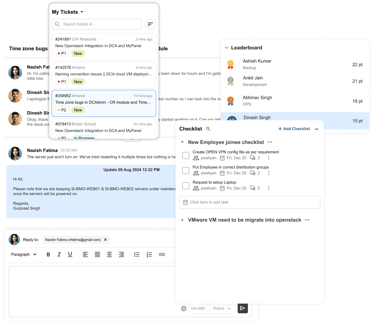
So, I started sketching. My goal? Make everything visible and accessible without jumping through hoops. That’s when the three-pane idea hit me:
Left Pane: All your tickets, right there. Need to find something? Use the search or filters. No more digging or endless scrolling.
Center Pane: The heart of the action. You pick a ticket, and boom! the whole conversation, updates, and replies are right in front of you. No pop-ups, no extra tabs.
Right Pane: The bonus round. Leaderboards, checklists, and all the little context tools you need to stay on top of things, without leaving your flow.
It’s like having your to-do list, your group chat, and your cheat sheet all open at once - no more toggling between windows or forgetting what you were doing.
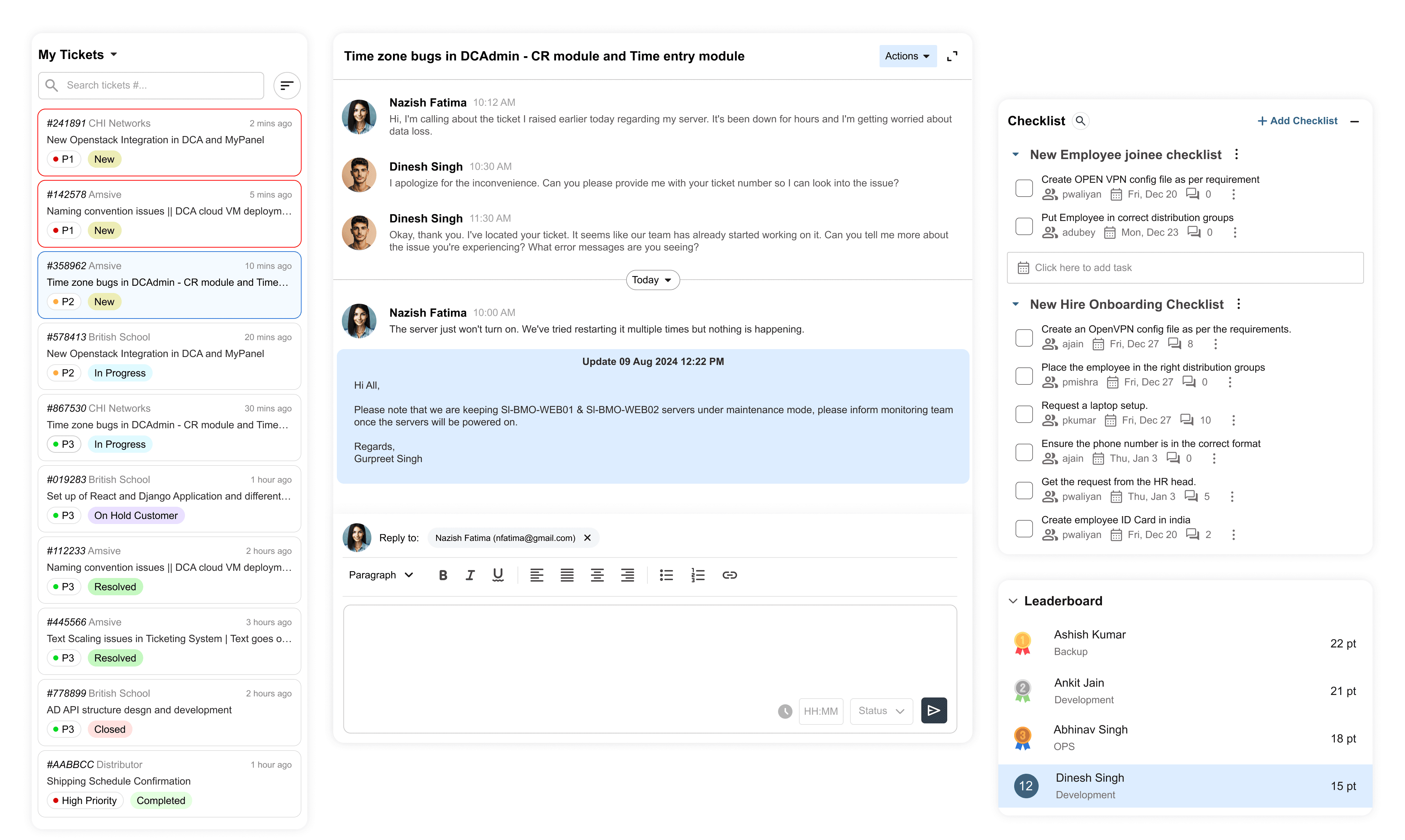
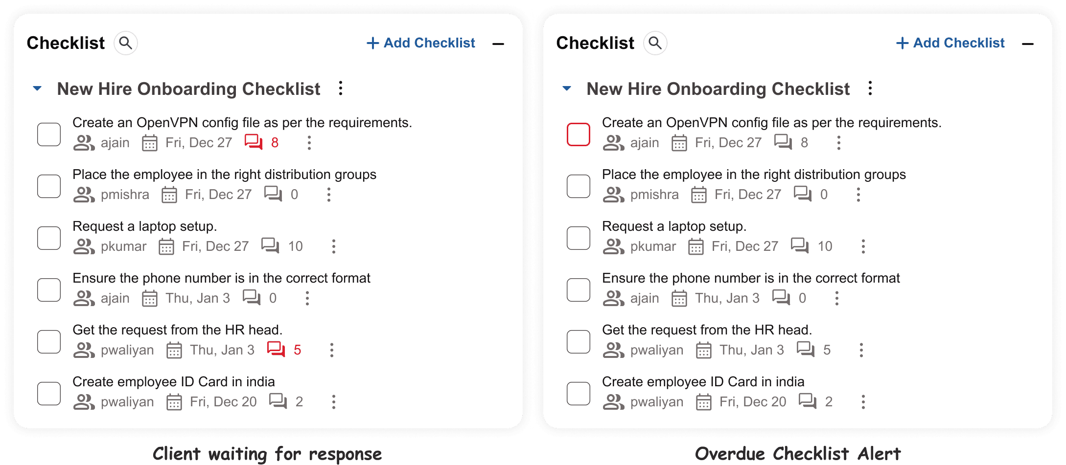
2. For Overdue Tickets
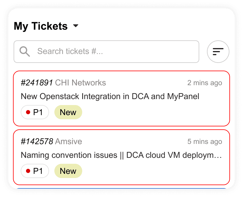
Tickets which are overdue will glow in red border to notify the ticket owner about SLA Breaching.
3. Threaded Conversations
Each ticket now reads like a chat. All updates, comments, and replies stay in one continuous view no digging, no back-and-forth.

4. The Real-Life Problem: Checklist Chaos
I made checklists their own thing like sitting right next to the main ticket conversation, but never tangled up with it. The main conversation stays clean and focused on the big picture, while the checklist is all about action items and next steps. You can chat about the ticket, and separately, you can tick off tasks without the two worlds colliding.
Checklist = Action Center: All your “to-dos” and micro-tasks live here, so you never lose sight of what needs doing.
Main Conversation = Big Picture: All the important back-and-forth, updates, and client replies stay here, clutter-free.
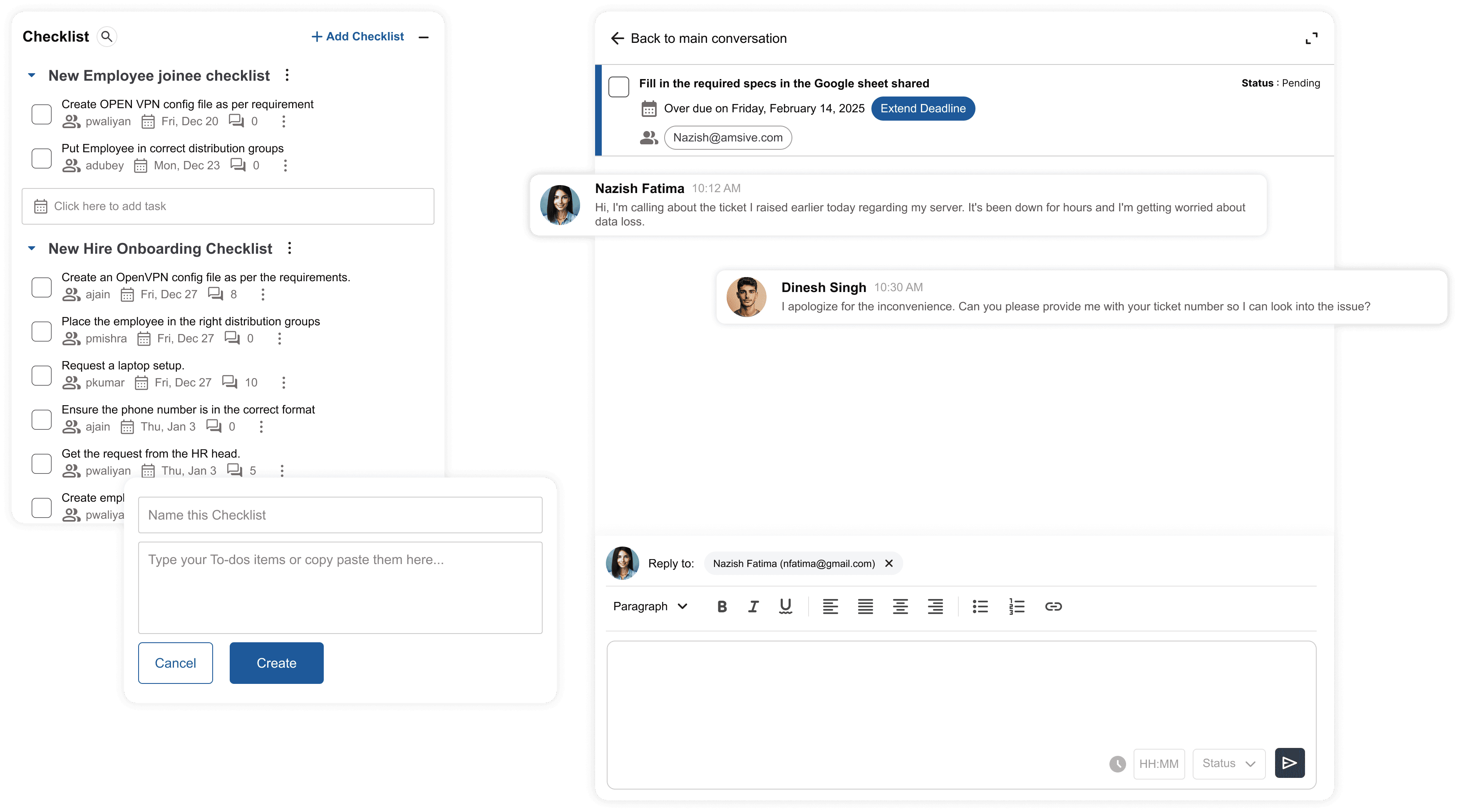
The Friendly Nudge: Visual Reminders That Actually Work
Now, we all know how easy it is to forget a checklist item and especially when you're juggling a million things. So, i added a little magic:
If someone doesn't reply or act on a checklist item by the due date, it turns red. Not in a scary, “you messed up” way, but in a "hey, don’t forget me!” kind of way. It's a gentle nudge that’s impossible to ignore but doesn’t stress you out.
Missed a deadline? That item glows red, reminding you (and your team) to jump back in.
Still on track? Everything stays calm and organized, no drama.
6. A Leaderboard System
To encourage timely ticket resolution, I introduced a team leaderboard that tracked points for actions like closing tickets, adding updates, or resolving issues quickly. But it wasn’t just for fun the top scorers each month received Amazon vouchers and discount coupons. This small reward system created a friendly sense of competition and directly helped reduce the number of overdue tickets.

The Moment of Truth: Did It Work?
After rolling this out live, the results blew us away. Overdue tickets dropped by 30% and that’s huge! The average time to process a ticket went from 10 minutes down to just 6.
Resolution times? Slashed from 4.2 days to 2.8 days. And get this like 89% of our users said they could finally understand ticket status without jumping through hoops. Monthly ticket completions shot up by 34%.
But…
Beyond the numbers, the vibe changed. People stopped dreading the ticketing system. They got competitive with the leaderboard, and you could feel the energy shift. They weren’t just using the system infact they were owning it. Even better, this efficiency trickled down to our clients with faster responses and smoother communication.
What I Learned Along the Way
Looking back, this wasn't just about redesigning a tool;
it was about listening to people and solving the right problems. Diving deep into user chats showed me pain points I’d never have guessed on my own. Iterating quickly with sketches and prototypes saved us from big mistakes down the line. And working hand-in-hand with devs made sure my vision actually came to life without hiccups.
Plus, that tight 6-week timeline? It forced me to focus on what mattered most. I couldn’t boil the ocean, so I zeroed in on cutting clicks, boosting clarity, enabling teamwork, and adding a dash of motivation.
Why This Matters
This project isn’t just a win for CHI Networks; it’s proof that internal tools deserve the same love as customer-facing products. When you make something people actually enjoy using, it transforms how a business runs - more efficiency, happier teams, better client service. We’ve laid a foundation that can scale as we grow, handling more tickets without breaking a sweat.