Streamlined Voltic Shipping’s landing flow to guide users through booking shipments with clarity and minimal friction.

The Problem
Maritime shipping powers global trade but at a massive environmental and financial cost. As part of the 10k Designers Masterclass, I was challenged to redesign Voltic Shipping’s landing page to clearly communicate the value of their solar-powered cargo ships and convert visitors into leads.
This project pushed me to understand the maritime industry's pain points and craft a UX that speaks directly to fleet managers and sustainability officers & turning a complex solution into a clear, compelling story.
The Goal
To redesign Voltic Shipping’s landing page in a way that clearly communicates their unique value proposition, solar-powered, zero-emission cargo shipping and drives engagement from potential partners by building trust, showcasing impact, and encouraging lead conversions.
Research
Maritime Industry Challenges in 2025
I conducted extensive desk research to understand the maritime shipping industry context, diving into reports from leading shipping analysts, environmental organizations, and regulatory bodies. Here’s what I found:
Environmental Impact:
Maritime shipping contributes 858 million tons of CO₂ annually equivalent to Germany and France’s combined emissions
The industry is responsible for 15% of global NOx and 13% of SOx emissions
International Maritime Organization (IMO) regulations are mandating a 50% emissions reduction by 2050
Public pressure for sustainability is mounting, with 76% of consumers now preferring brands with eco-friendly shipping practices
Financial Pressures:
Fuel represents 50–75% of vessel operating expenses, creating significant budget volatility
EU is implementing carbon taxes of $110/ton of CO₂, translating to approximately $6,800 in penalties per voyage
Geopolitical conflicts have forced rerouting of vessels, increasing transit times and operational costs
Shipping companies face growing pressure from investors demanding better ESG (Environmental, Social, Governance) metrics

Competitive Analysis Insights
I analyzed websites of companies like Yara Birkeland (autonomous electric ships) and Wind Ship (wind-assisted propulsion) to understand how they communicate their value propositions:
Most competitor sites buried key statistics in dense paragraphs
Few offered interactive tools to demonstrate value
Many failed to adequately address financial benefits alongside environmental ones
Visual storytelling was generally weak across the industry
What i did (The Design Process)
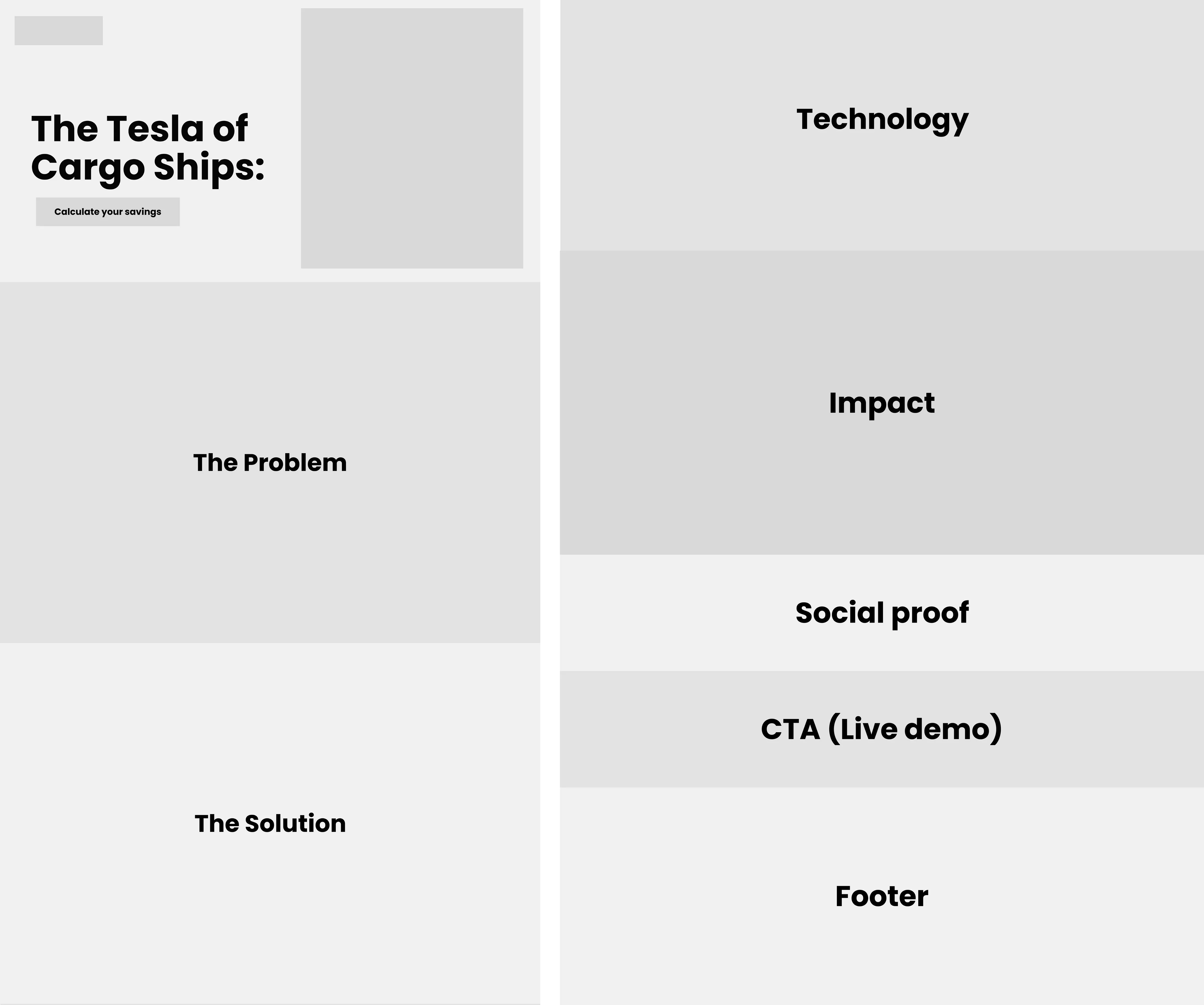
1. Information Architecture
I developed a narrative flow to guide visitors through a compelling story:
Hero Section: Bold headline establishing the revolutionary nature of Voltic ships
Problem Statement: Highlighting the environmental and financial costs of traditional shipping
Solution Overview: Introducing Voltic’s technology with key benefits
Interactive Calculator: Allowing users to personalize potential savings
Technology Showcase: Visualizing key technical innovations
Impact Metrics: Making environmental benefits tangible through comparisons
Testimonials: Building trust through social proof
Final CTA: Creating urgency to book a demo
I sketched several variations of this flow, testing different orders and emphasis points before settling on this sequence.
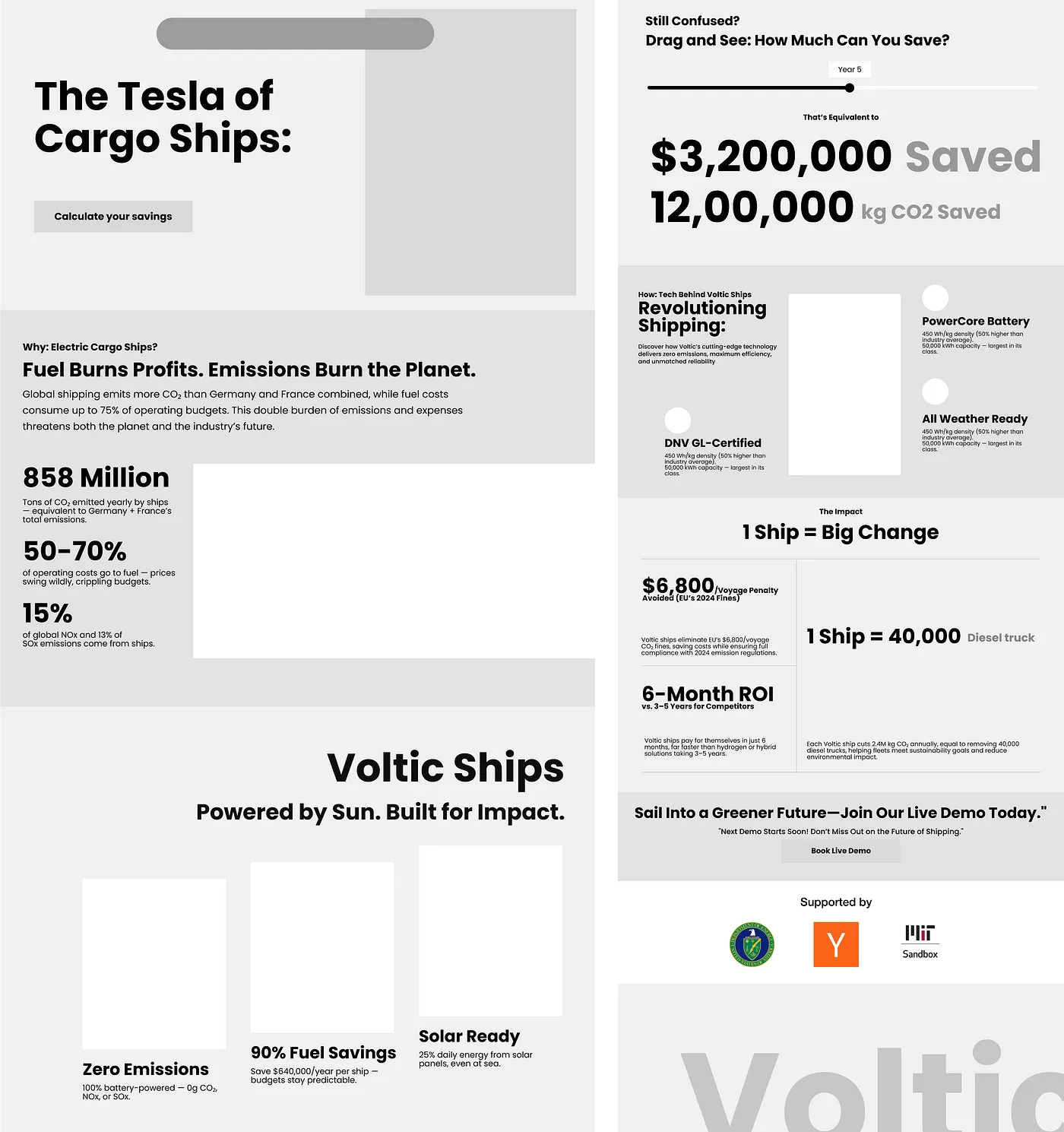
2. Wireframing
I created low-fidelity wireframes focusing on content hierarchy and user flow. Key considerations included:
Above-fold content: Ensuring the most compelling value proposition was immediately visible
Progressive disclosure: Starting with simple, impactful messaging before revealing technical details
Visual balance: Creating rhythm through alternating text and image-heavy sections
Decision points: Strategically placing CTAs at moments of highest engagement
I iterated through multiple wireframe versions, focusing on creating clear visual hierarchy and ensuring the most important information stood out.
Detailed Design Decisions
1. Hero Section
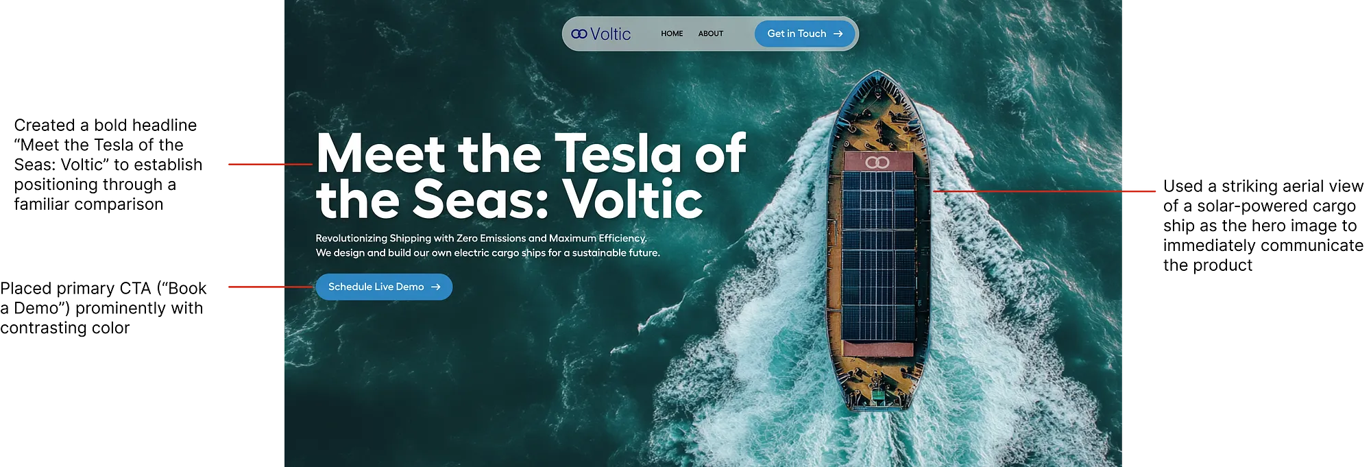
The “Tesla of the Seas” metaphor creates immediate understanding of both the technology’s innovative nature and its industry-disrupting potential. The aerial view provides a clear visualization of the solar panels that differentiate Voltic ships.
2. Solution Section & Interactive Savings Calculator
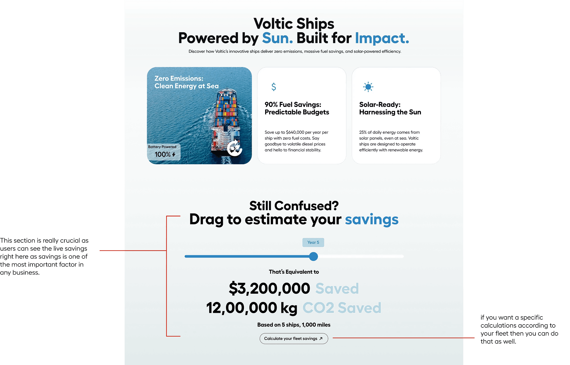
The three-card layout creates visual balance while allowing each value proposition to stand on its own. The combination of icons and concise text ensures quick understanding of core benefits & The interactive calculator transforms abstract benefits into personalized, concrete numbers. It engages users actively rather than passively, increasing both time on page and emotional investment in the solution.
Figma Link
https://www.figma.com/proto/Kp9dv8bLQSVlAMbpDOp9so/Assignment-2---Design-Studio-Simulator?page-id=35%3A10&node-id=35-11&viewport=463%2C112%2C0.29&t=AxlY1bp0iiWqDbaK-1&scaling=min-zoom&content-scaling=fixed